Hobie Rebrand
About
Hobie has used the same logo, or variations of the same logo since they were founded in the 1950s. Since then, their reach has expanded worldwide and the 50s surf-style logo does not suit them anymore. In crafting their new logo, I aimed to modernize it to represent how they have changed over the years. To emphasize their adventurousness, I decided on a rounded typeface and included the wave in the H. I chose blue to emphasize the connection to water, since they focus on water crafts and sports, but also chose a shade to help modernize the brand.
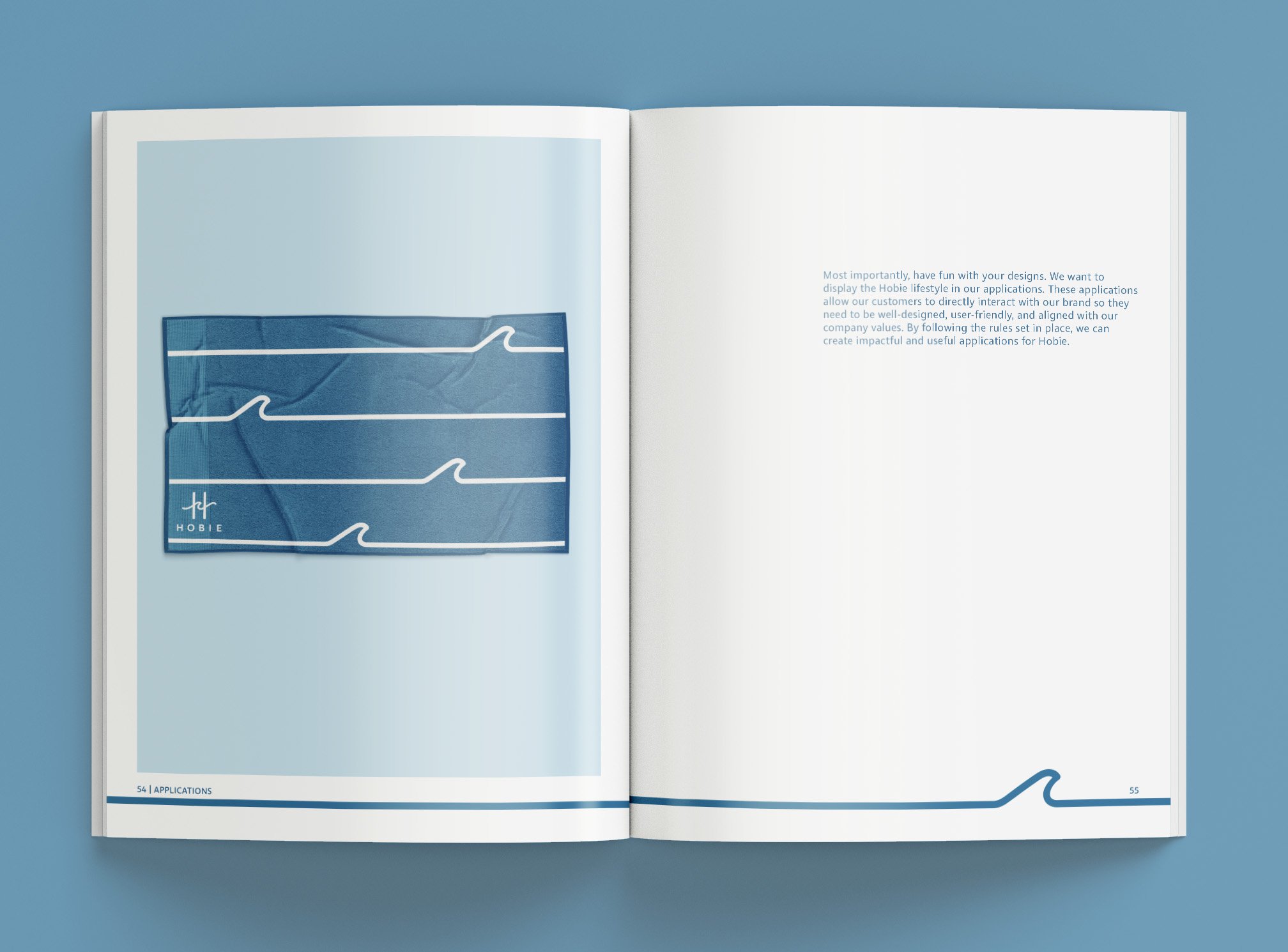
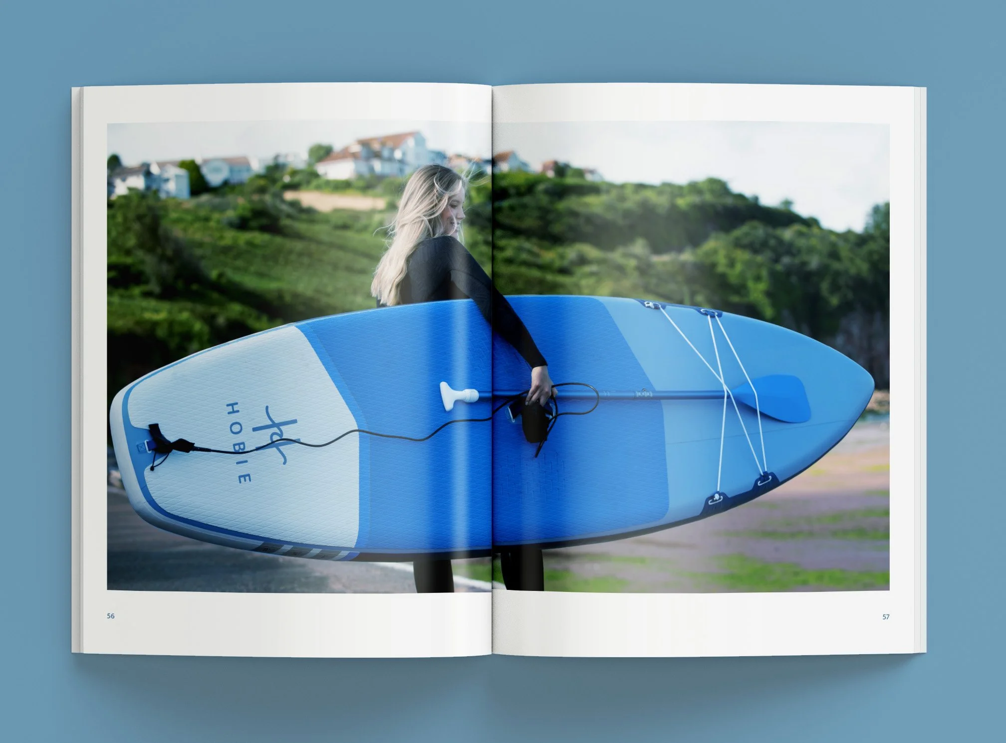
In creating the style guide, I worked to represent the brand in the modern way that the new logo suggests. I also worked towards keeping the home-grown and friendly nature of the brand. While creating the rules for this guide, I learned that using one color was a great way to make everything both cohesive and modern. That one color being blue also strengthened the brand’s connection with water, along with adding the trust and credibility associated with blue. Through photography, I aimed to capture the Hobie lifestyle, not just the Hobie products. By doing this, the images translate a desirable lifestyle rather than another thing to buy. I also looked to display the brand’s modernity and lifestyle in the combination of photography and type by using inviting imagery and simple text. Overall, in this guide, I wanted to create the brand’s personality to reflect the modernity and personality shown in the new logo.
Below is the style guide in its entirety along with the logo and process behind the final logo.
Final Logo
Process
Applications
*concept


